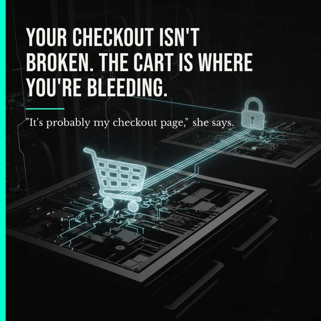
"It's probably my checkout page," she says. Third time this month. "People add to cart and just... vanish."
Her developer already rebuilt the checkout twice. New layout. Fewer fields. A progress bar nobody asked for. Conversion barely moved.
She's fixing the wrong room.
The benchmark data shows where users actually vanish
Mida's 2026 Ecommerce Conversion Funnel Benchmarks analyzed 958 Shopify stores and 2 million carts across H1 2026. Of 1,000 users who add to cart, only 42% even begin checkout. That's 420 people. Of those, 57% complete purchase, landing at 239 finished orders. Everyone stares at that second number. The real damage happens before it: 58% of users never make it from cart to checkout at all. Not abandoned checkouts. Abandoned intent.

Here's the mechanism. Cognitive friction doesn't add up step by step, it compounds. Every extra field, every second of load time, every unresolved decision drains a finite reserve of willingness to keep going. That reserve gets spent mostly in the moment between "I want this" and "I'm committing to buy this," the click from cart to checkout. By the time someone reaches the checkout form itself, they've already decided. The form isn't where they leave. It's where the ones who survived the cart show up.
Two different failures. Two different fixes. One industry treating them as the same problem.
Which is why checkout optimization keeps producing marginal gains on the wrong variable. Baymard Institute audited 500,000 checkout sessions across 224 e-commerce sites in the US, EU, and Asia-Pacific. They documented 140 separate causes of usability friction. Even so, fixing checkout design alone lifts conversion by 35.26% on large sites. That's real. It's also not the leak. It's the fix for people who already decided to buy. The 58% who dropped before checkout never got that far.
Measurability is not the same as relevance
Two different failures. Two different fixes. One industry treating them as the same problem.
Most CRO work falls into this trap: optimizing the page with the most visible abandonment data instead of the step with the actual leak. Checkout has forms, analytics events, funnel charts. It's measurable, so it gets attention. The cart-to-checkout transition is quieter. No form to A/B test. Just a button someone almost clicked and didn't. Harder to diagnose, easier to ignore, and it's where more than half the users are gone before your checkout team even sees them.
An infrastructure built around a brand's actual data, not a generic best-practices template, treats cart-to-checkout as its own diagnostic layer, separate from checkout completion. Different friction. Different cause. Different fix. Unrealville Studio's Blueprint layer maps a brand's funnel against its own behavior data before any redesign gets proposed. The fix for a 58% pre-checkout drop is never the fix for a 43% checkout abandonment. Treating them identically is how teams spend a quarter rebuilding the wrong page.
The structural causes checkout audits cannot see
Somewhere the friction is structural, not cosmetic. A shipping cost that surprises at the wrong moment. A required account creation. A load time nobody's tracked in months. None of that shows up in a checkout audit. It shows up in the click that never happens.
Forward. Always. But only once you've fixed the room where people are actually leaving.
❯ Unrealville Studio